Monday, February 28, 2011

week 5

My original intent was to have the whole thing cut paper, and then when I added the paint to the skin to just get an idea value-wise of what I was going for I think I may leave the skin as the soft smooth paint texture. I'm not sure.

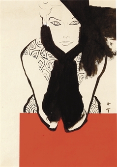
I'm leaving on a week long road trip with my mother tomorrow, going up to my cousin's wedding in Portland Maine, via NYC. We are going to stop into MoMA to see AbEx. This will be my second time viewing the show, but I could live in there, so I'm totally excited again! So what I'm going to take to work on is a bunch of thumbnails of this composition and markers and magazines and I'm going to finish cutting out the hues and and map out the color fields. I'm not sure if I want the straight hair lady to have blue hair with a black background or vice versa and depending on that i don't know what color the orange lady's clothes will be. So I'm going to figure it all out this week, including addressing in writing why and how this is satiating some of my stuff and what doors it's opening.  And then I'll finish it up the following week.


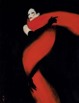
I absolutely love how the orange hair turned out. I tried to pay attention to the nuances of the value and temperature to create volume. I'm still going to glaze over this and obscure some of it. That's part of why I don't really want to the skin to have the same sort of texture. but it seems like if the hair and clothes have similar textures, those elements are part of the fashion industry, so the background should be different. I'm not sure what though, maybe one large piece of paper? I'm  not sure. still schemin'. Any suggestions?


Wednesday, February 23, 2011


I think I'm going to go with this composition(ish), but change the color palette entirely.

I want to do and orange fro inspired by this image in this months W and this illustration by Erlich.


Sarah's comments

Love this idea and the scale. I have only one serious concern: when you go that large with lauan, it will warp very quickly. It needs to be "cradled" - that is, made into a panel with supports on the back. Might be more expedient to get a large panel to start if you can find one locally. 40" is pricey to ship!


My reply:
Honestly, I have a ton of unsupported paintings on luan that size and bigger, I don't care about warping right now. It is already with no paint, it's the nature of wood and gravity. If I sell it I can deal with it then. I know how to easily build a frame, but it takes time and money I don't have. That aside, I like to keep my surfaces as cheap and easy as I can so they aren't "precious". It keeps me aggressive and daring.  Since it's acrylic I don't really have to worry about cracking anytime soon, so as far as I'm concerned, it's all good. Plus, adding support to panels takes up space don't have, too, and more likely to damage each other. If you are good, I'm good. I consider myself warned and aware. Painting this scale is nothing new to me. And I already bought the luan this morning.


project 2 proposal


Ok Sarah, I'd like to shift to the other side of the spectrum on this next project. I know I said I didn't want to work too large on these heads because I wasn't sure space wise if I could swing it, but I think I can. I want to do one large composition with 2 heads. When I say large I mean something like in the 36-48 range. I'm going to measure my car and see how big I can get and still bring it home. I'm going to work on luan and I'm going to use cut/torn paper from magazine and adhere them to the luan with clear gel and then use wet and dry media over the top to manipulate the tones. So, it will be the same process of finding all the papers. I'll need a hue for each skin town, a hue for each hair a hue for each clothing item and depending on the busyness 1 or 2 hues for the background. I think I'll choose the colors based on supply, because I know that seasonally what's available shifts. Fr example, red is so in right now, where 2 years ago it was really hard to find a lot of reds in high-end mags (which is what I have vogue and W). I will cover the board with paper entirely before going back in with pigment. I will be using only acrylic as far as wet media goes, but I will play with wiping. Also I got this iron oxide from my figure sculpture teacher in Jan. We used it as surface treatment on our clay pieces but she gave me the leftover and suggested I try it in paintings. She uses it in hers (she was a painter before she because the most amazing sculptor, Debra Frittz.

I'm working big in my painting DS but I'm exclusively using paint and at this point trying to keep the images totally abstract. But I'm itching to do these heads big and see if they translate. That way if not, I can just let that idea go and work smaller on my 3rd project. But even as I wrote that I wasn't going to work big in here it made me a little bit sad. I projected that I would maybe try to work the heads into the abstract painting but it doesn't really go in there and it seems natural to do so in here, now.

So is that ok?


Tuesday, February 22, 2011

week 4

I decided not to use the faces. I did try some features, but having some begged the question, "Why those and not the rest?" I couldn't answer that question, they seemed arbitrary. Having all of them made the compositions a lot more busy and since the "who" wasn't important to me, I opted for none.


I'm happy with how they turned out! They don't look all that different from last week but they are a heck of a lot more portable and I can finally open the windows (too bad it seems the nice weather has passed for a while)!

all 6"x6". various papers on paper.


Sarah's feedback:
Hi Emily,
Really enjoying seeing this work evolve - it feels like you are bringing together many of your ongoing obsessions and impulses into a coherent and provocative series. Fashion, pattern, figure, all come together here - but this does not feel at all slight. I think you are hitting on issues of identity, and (forgive me) consumer culture in a humorous but pointed way.
So glad the faces are missing - we are distracted, appropriately, by everything else here. he context, the accessories, the color palettes (as if each person has become a fashion story board) and the very delicate construction. Each figure is just barely holding together - we are aware that a piece might fall and reveal a contradictory layer underneath.
The craft here is just right - it is important that we see that these are cut and pasted and just barely glued together, just as identity of appearance is completely ephemeral. The blank space of the face is funny but also incredibly poignant. We cannot see who the figures are, and yet they seem to be working hard to construct their own existence!
So what next? I definitely think a giant piece is a great step. This is amazing and rich territory. How are you feeling about it? Are you interested? Hope so...this could keep you occupied for awhile.
S

My response:
I am interested. As you know identity is an ongoing fascination for me, how it changes over time for one person, how it changes by the minute based on audience, emotion, and other environmental factors, the difference between how one thinks they are perceived verses how they are perceived  by others  (johari), how society expects people to present themselves. The chick or egg scenario with identity and consumerism, the continually obsolescence and simultaneous timelessness of pop fashion.

The new big one will have the layers more buried, sort of encased rather than something so delicate this will be cumbersome in a way, like you'd need a chisel or a pick ax to get through to whats underneath. I'm curious to see how I feel after I do the big one.


My response to an inane "peer" comment:
 I think anything involving humans has an underlying story, the viewer may be projecting but that's what we do as humans, put our own stuff onto everyone else. The reason they are better faceless is because it does leave space for the viewer to put themselves into it. It creates more space for possibility instead of punctuating the story. The ones with 2 people have a dialogue between characters with body placement and styling. The ones with only 1 figure beg more questions about the solitude, one looks lonely, one looks confident and they don't even need the features to say these things. 

Thursday, February 17, 2011

week 3

Ok so this turned out to be much more intensely time consuming than I'd hoped. I'm still chugging through it but here's the halfway point. I'm still working on it tonight, but I wanted to get something up in case my hand completely locks up, it's sort of a gnarly claw as it is. I'm excited about how they are coming along (I ditched the fabric and color scheme a little bit because I wasn't able to cut the intricate pieces out of a lot of the stuff I'd originally planned to use. But overall I think the simplified color-blocking looks better anyway.  I severely hope the gluing takes less time than the cutting. It should right? Because these are taking between 2-3 hours each, granted I did the most complex ones first so I'm hoping it'll get going faster.

Wow. That was intense. Moving on... I really like the 3d quality of the photos of these, I think I'm not going to do chine colle but rather do a direct method with no pressing glue them back to front and let the overlapping-ness be a positive feature.


Sarah's feedback:
"... I really like the 3d quality of the photos of these, i think I'm not going to do chine colle but rather do a direct method with no pressing glue them back to front and let the overlapping-ness be a positive feature."
Yes! I would say go even further - figure out a way to keep these loose like they are now, but somehow tacked into place. Perhaps using a small piece of matte board behind key areas to keep them lifted slightly and overlapped. And think about putting them onto a different matrix that might emphasize this - black paper?
I also rather love them with no faces. Perhaps minimize the features?
You are on the right track. S

Sunday, February 6, 2011

week 2

I decided to focus in on just the portraits. As I've been working it came to be obvious that these are in fact not tests. They are a collection, a project. They are important to each other but should also stand alone. I'm serious about them. I want them to be good and resolved.
I know I picked out all those palettes but I've decided they should all be variations on one palette to help the cohesiveness of the project. The palette is mainly yellows and browns with accents of greens, blues, and bright red.
I finished cutting all the patterns tonight and then I'll cut all those pieces out of the colored/printed papers/fabrics next week and then adhere them all and finish them the week they are due. (or maybe finish half next week and finish the other half the next week). Is that ok Sarah?

It's weird this process is actually super similar feeling to stained glass... I wouldn't have made that connection but it's an interesting sort of comfortable working place, lots of card stock and tracing.


Wednesday, February 2, 2011

Topic: general proposal

Advanced Students must submit a general proposal for the work they want to complete during the semester, including the techniques you hope to use, the scope and type of projects you hope to complete and the ideas that you will be exploring.


 I am going to focus on fashion heads. I'm going to stick with the curriculum schedule and do 5-10 6"x6" tests per week (maybe more depending on what it is I'm doing) Then for the projects I'll do bigger ones and apply things I learned from the tests. I'm going to use fashion mags as models to start, but if I get the urge to try to do likenesses of people I know, I'll do that when it feels right, but for now, it's not about that. I probably won't go HUGE because I'm working huge for Tom and my little house can only accommodate so many huge wet paintings at a time. But If they NEED to be bigger, well I'll figure it out when the time comes! I don't want to have too much of a plan. I'll be planning myself sick in search for who I truly want to project to world for the fashion design class (11"x14") and I'll be lost in an existentially questionable sea of massive abstraction for Tom so this will be a nice crossover place where everything just naturally converges and flows out. (hopefully, and in theory)

I really enjoyed making and still enjoy looking at these, so I think of them as a starting sort of blueprint for content (not these in particular, necessarily, but similar). I have millions of ideas about how to execute so I'm going to non-methodically go through them all, something like my ceramic surface tests where I just did stuff, took notes, and tried every combo in different orders of layers. As I said I will not be doing encaustics, but I will probably do everything else I can possibly think of and use every type of media I have (which is pretty much everything at this point).


Sarah:
These are intriguing, and altogether they have that sense of repetition and play that I remember from your work in the last class.
While I want to give you plenty of room to play in this class, I would like to see you begin to narrow in on a project as you go. Perhaps these, as a group, can provide an overarching structure.
Play - but play seriously and aiming for resolution.
Sarah

discussion: favorite artist right now!

Please tell the class about your favorite artist - or your favorite artist right now! Include:
1 - Some biographical information
2 - At least 3 images of their work - as attachments or embedded.
3 - Something about their process and the concepts in their work.
4 - Why they are important to you as an artist right now.


René Gruau- Italian

(1909-2004)

René Gruau strongly impacted the way high end fashion was advertised. Not only was he a painter and illustrator, he also collaborated with the designers as they created the clothes. I think it's interesting that Nicole mentioned Toulouse-Lautrec in regard to my work, because Rene Gruau strongly referenced the old world luxury of the days of absynthe and Moulin Rouge.
One thing I didn't know (or deduce rather because it makes sense) is that Rene Gruau collaborated with Christian Dior on the New Look. I'm not going to say which is the chicken or the egg, but the New Look parallels women leaving the factories and getting back in the kitchen, post-war 1940's (it actually came out in 1947, I believe) The characteristic's are sloped shoulders, a corseted waist, a ridiculously full skirt with a below the knee hem. It's basically June Cleaver. Dior and Gruau also came up with the pencil skirt which is back HUGELY especially for spring!

René Gruau illustrated for all the absolute top magazines of his time and created the first real cross over between fine and fine fashion arts, paving the way for collaborations such as Warhol and Tiffany's. His work is also owned by top museums and collectors including the Louvre. And recently there was a retrospective show up at the London Fashion Illustration Museum.

Why it's important to me right now is because the materials and the subject have a nice equal relationship. He uses the physicality of ink or charcoal or paint to create fabric or feathers or features but they don't lose their art supply properties in illustrating. They are elegant and clever and bold, sexy but classy. They defined the times but also are artifacts of that time. I mean really, what is not to love?

I also think it's interesting because I'm obsessed with Abstract Expressionist New York, and this art was being made in the same town at the same time as DeKooning was scratching out his women and Motherwell was politically collaging up a storm.


ds3: Advanced Mixed Media © 2010

Blogger Templates by Splashy Templates