Wednesday, March 30, 2011

project 3 proposal

 Based on Gucci Fall 2011 hats:


I haven't decided which of these to use or to do my own based on these, but I started this black background on a 40"x48".

I think I'm going to do one a little smaller first just to have a better idea of what techniques I want to use, before tackling that huge one! I'm not going to draw it out, I'm going to problem solve like a painter. I'm not exactly sure what it will look like. I really didn't do any painting over spring break...
I love the richness of the colors and the myriad of textures. I love the shape relationships in these of skin:hat:top.

Thursday, March 24, 2011

week 7

I'm afraid it's not as obvious that I worked on this as I thought, but as I started it became clear to me that what it needs is not a drastic makeover but rather many subtle (and occasionally different) layers of similar colors to build a richness. It was too physically shallow before. I followed advice and added more of the other colors to the other colors, lightened the brown, (right now the background is lighter but I'm going to do some more layers on it. I obscured the magazine cut outs a little more, and used a few dry medias in the hairs.

I can't seem to get a neutral background, true colors, and no glare or funky shadows tonight. I've tried every configuration of lamps and propping... It's still has some wet areas, which aren't helping the glare factor. I'll post the best of what I got, but will keep working on it over spring break and resubmit the following week. 


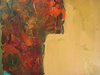
Reshoot: much more accurate color, still some glare.


Comments and feedback from class:

Student:  Judy 
I can see the subtle changes in the orange hair and the details added to the purple shirt.  I think these all look great and add a lot to the piece.  I found to photograph without glare I had to finally invest in photography lighting.   The cheap way is to put translucent paper such as tracing paper over your light fixture to diffuse the light more and then that should help with the glare problem.
 
student: Loulie  
I love all of the textures... not only the collaged papers, but also the brushstrokes.  The complexity of textures works well with the simplicity of the image.

Student:  Lori  
the textures in the dress are really becoming lovely texture and layers is key to this artwork.  

Student:  Nicole  Subject: 
Good to see you working with this image more, and to see more textural painting that is characteristic of your work. Post again, when you can. I'd like to see your progress.

Me:
I think I might be done with this one for a while. Work on the new thing, learn from it and then decide what to do next on this.  (I posted the reshoot, above, today. The color is much truer to the real thing!)


Student:  Dacey  
The main figure is pwoerful, but the dark hair of the figure on the right creates a hole and the work is unbalanced.  Maybe work more in the figure with the orange hair to distract from the dark image.

Student:  Nicole 
Dacey is on to something here. Perhaps more detail or smaller intricate forms could help with the balance.


Student:  me

Here's the thing. I think that's all a bunch of nit picking. Even though this is a "project" it feels more like a large-scale test. I have lost all sense of obligation to make this one "work" right now. I feel like I got what I needed out of it to move forward. I don't think tweaking it here and there is the answer. Once I get a few more done in sort of this vein, I'll revist this and probably overhaul it.  Thanks for tha advice, but at this point little adjustments are feeling kind of moot.

My question is if it's a color/value issue how come no one said any of these things back when I was doing my color tests...???

Granted the brown is a tad lighter, but ultimately, I think the same issues apply with weight, balance, contrast, depth perception, etc. In the next one I'm taking into consideration where colors naturally appear in space as I build it so that none of these issues will be relevant.
And adding detail to the hair is NOT the solution. As is I feel like the orange hair is too separate because it's too detail heavy. I promise giving it more detail will not detract from the black.
https://blogger.googleusercontent.com/img/b/R29vZ2xl/AVvXsEhcIvogEtZd4I_m9bC0mNlDeiS6TeKvqiBZtvhN_WGrRWx8Ytut0m7ZBc-4UzHYHJfp11PjtVJTkYF5TrptoBkZB4o2mi8KmnZP-nkg9ktLndpPI8Tniguzfc1UVZ5eVp5bDQctnoZh7-E/s1600/7_1+detail+d+ee.JPG

Does anyone have feedback on the larger concept, because I'm a lot more interested in that than subtly changing relationship of the planes of this thing.


Instructor:  Sarah    
Hi Emily,
I think this is dramatically better and I can see how you might proceed with this kind of work. I agree that it is probably time to put this aside and start work on the next one. So these are not notes on what to do here, but things to keep in mind as you go forward:
The composition feels fine to me. It may not be traditionally correct but it works - in part because it rebels in a conscious way from what we expect.
The detail is fantastic - I suspect that this is even better in person. (Sigh) I would think more consciously about the edges when you move to the next piece, though. How thing behave as they hit the edge of the panel is crucial. I won't say what I think is "correct" but here, the edges feel like an afterthought. They can't be.
The absolute emphasis on color and shape and texture actually returns us once again to identity. Who are we beyond our surface and yet how much of our response to others is based on shape, texture and color?
S

Student:  Nicole Subject: 
So your goal with this painting was to encorporate flat planes of color for the heads, with the contrast, texture and focal point being the collaged hair?


Student:  Emily Ellingsworth  
Subject: 
In reference to: post by Nicole Lamothe
So your goal with this painting was to encorporate flat planes of color for the heads, with the contrast, texture and focal point being the collaged hair?
Yeah, the goal is for the interest to be on the "fashion", not the "person", as in fashion illustration and design. It's not about the model, allowing space for the viewer to project their self into it. I'm not sure that's entirely the point, but something like that.

Student:  Emily Ellingsworth 
Subject: 
In reference to:  post by Sarah 
Sounds good. Thanks! I have 2 "small" ones (approximately 15.5"x18") in the works so that I can work out some of the technical issues, application, etc. Then I can take what I learned there for the giant one (48"x40").


Friday, March 18, 2011

Midterm - Self Evaluation:

Please make a detailed post about your progress in the class so far, using the following questions as a guideline:

1) Tell us which techniques, so far, are the most interesting and valuable to you and why. How do you see using them in your future work?

2) How have you developed your conceptual skills in this course? How do your projects reflect the ideas in your overall art practice?

3) How do you feel about your own contributions to class critiques and discussions? How have these topics helped you think more deeply about your work?

5) Tell us about what you want to accomplish during the rest of the course, including techniques you may want to practice more, and ideas you want to explore in your work.


So far I've only done 2 techniques in this course (vastly different than my first go round), the intricately cut paper heads and the large mixed media (paper, charcoal, acrylic and paper) on wood. I think the first project was more successful both conceptually and visually. It became something along the way and I like them. But I think the second project is a more important piece in the large puzzle of my graduate work. or rather, it's more closely related, in scale and process.

For the past year I've been working on trying to marry abstract expressionism with fashion illustration. I recently submitted to the notion that maybe it's not about marrying them but rather having them both, letting one be a getaway from the other. And as per my life just when I allow that to be ok, I start to feel like there is a chance to actually get to that "center core" I've been chipping away at. I do feel like this class is helpful in that I don't have to do specific assignments, it is definitely the in between point of fashion croquis rendering and abstract expressionism. I feel like I'm finally working toward some larger goal as an artist. Working big just feels right. It makes my body feel good, lots of moving around. The way I think I will proceed as I've mentioned is to keep working on the big head to get it to some place that excites me. (I'm not sure how long though as i may pass it conceptually by with a new composition, but at this point l have nothing to lose in trying to push it further.)  Next I'm going to try a single head, and I'm going to draw it on the board from a fashion mag. The ornage hair lady is so far removed from the original. I don't even know what original photos these girls were from. Then it became the cut paper, and then on the large format and marker.

As Sarah said in my crit the small pieces, created a dialogue about identity, surface, sameness and difference. This is totally true, However that was not the original conscious intent. It became that along the way. I think my intention for this next piece will be truer to the original concept of the cut paper, than even it was. I want to use the image as a tool to focus on the materials (mainly acrylic paint but some cut paper, dry media, etc). I always want my painting to be about the materials, image is secondary, it's important, and it does things to the mind, but it's just second to the actual materials. I think looking and paintings from across the room is boring.  It's weird because even though I feel like the big heads are closest to what I want to pursue in some ways it's really convoluted.

I have definitely been less verbose in here than in the past, but I feel like the feedback I give is honest, direct thorough and well-intended. I always enjoy the artist discussion topics because I'm ever hungry for new people to look at. I try to find ties to my own work in all other work. I think it's important to have an objective notion of where one's art fits, historically and in the current world.


Sarah's response below:

Hi Emily,
Thoughtful post.
1 - Yes - and I appreciate that you understand where you want to get to at this point, even if it is not obvious to those around you. Graduate school is not about doing what the teacher says, but finding your own core direction, both becuas of, and despite, the feedback you receive.
2 - I think this is a very interesting comment. And Fashion is also about materials first - the figure is just a "holder". I know I have mentioned Vivenne Westwood to you before, but this makes me think of her again. Her work is essentially about materials.
3 - Not to worry - you have been plenty verbose. And yes, finding yourself in context is one of the KEY things I want students to understand. If you don't know where you are in the ongoing art dialogue, you cannot enter the conversation meaningfully.
S

Monday, March 14, 2011

Project 2 "finished"

I did what I said I was going to do, The blue was flatter but then it got messed up a little so I redid it, but couldn't get it quite as smooth and flat as it was because of being sloppy adding paper (didn't realize it would matter at the time). It's also not as bright as it was. It is what it is for now. But I think I may change it a lot. It isn't screaming "finished" or "ah ha!" yet. I also this week played with the magazine pieces in abstract. I think they are a tool, I just haven't figured out how to use the tool quite yet. I'm not really disappointed or discouraged, I just haven't quite pushed it over the edge yet. It's just a stepping stone.


40"x40". Acrylic and paper on wood.

 (right click view image to see bigger picture)


 Here are some details and a context shot for scale:


This is a peer crit by my classmate, Judy, and my comments are in gray:
Emily,
You were quite ambitious to do such a large size for your second project.  Some things I notice when my pieces went larger was that the simplicity had to be more detailed.  You have a good start but as you said it is not quite finished and is missing that aha!
First, Your composition is good with the faces being cut off..the face on the right side needs more contrast of color it looks to be too dark of a shape and too large of a dark shape for the overall composition. I agree but the photography definitely is not showing it off well either.  If the face was lightened I  think that would solve the issue.  Also I think the larger shapes such as  the light face are missing detail / shadow and are reading very flat..would you consider some shadowing or additional layers to liven it up?  No. I don't want the attention to go there. It's not about the face. I really like the one curly piece in the orange hair and wish for more of that level of detail in the hair that would give it some additional texture and more to focus on. 
 The values shifts are very similar and missing more of the middle-darker value, a few steps from the darkest to the next middle value might give the piece some overall interest.  I only see three value changes, the hair, background and face are very similar and the clothes and other face and hair read as the same value.
I like the faint pencil lines that are showing through.  Another idea might be additional linework or marks to enhance the edges or give the piece some more detail...charcoal? The "pencil lines' are charcoal, remember the scale. the charcoal i used was huge (now it's gone)
Last idea, the dark face and hair in the foreground is really intriguing trying to figure out what their relationship is...perhaps  the dark hair could get another layer to lighten it slightly, leave the face dark and overlap the figures a bit more with the hair.  What are you trying to say with their interaction?  What is the message? Honestly I don't know. I just had to get this big to see where to go with it.
Could the background go a shade darker to put it back more and not be so close in value to the face? This is nitpicky, I think the issues are much larger than slightly changing a color. For this type of crit I understand because in theory it would be "done," but I'll keep darkening it up a touch in mind when I work on it again. May all be surprised at what I turn in Sunday.
Overall I liked your faces from the start and the different styles you have shown are really intriguing from past postings.  I know the size gives this piece impact and you are on your way to a really great finished piece.  Good work!
Thanks Judy. I will take all of your comments into consideration as I proceed.

 Here is Sarah's crit, my comments, still in grey:
Hi Emily,
Sorry to take so long to get to you. I am going in order of posting - and the outside world is interfering in my pace! No worries i definitely know how it goes. I did abstract painting all day with the windows and doors open and it's still 81 degrees! Woo hoo!!
Judy pointed out - and I am sure you already knew - that everything changes when you start working large, in ways that you cannot always anticipate. I love that you went big, and I think that you should do more of this, even while I don't feel as if this piece is fully resolved. I plan to in here. I think I'll start a one person one during spring break and in addition to working back into this one this week.
The intention of your work changes completely when you get to this scale, and also when you go from multiples to a single piece. Oddly, while your cutouts felt like more than enough, this feels like not quite enough (even though there is so much more here, more pieces, more shades, more of everything really.) Judy suggested that you need more detail and texture, but I think you might need less. This piece can't really have less, but it can have more, and so i always feel like, if it's not the best it could be, why worry about ruining it? Charge!) I know you are not intending to replicate what you did with the cutouts but I would think about how to get the same idea of flatness and fragmentation here. I don't necessarily feel that way. I wanted the blue to be flatter, but i really don't feel like i need to be accomplishing anything even related to the cut paper ones. This is a totally different thing. I was just using the cut paper as composition to think about and investigate something different through something vaguely familiar. I'm not opposed to the flatness necessarily but...
This feels too much like a "Painting" to me. To add more detail, texture, shading, etc. would just take it further in that direction and that is not you. Instead, I think you need to find a way to make most of the areas extremely flat (Self leveling gel? Enamel? Meticulous brushwork?), while pushing the crazy texture of the hair and the color more. I am a painter, everything that takes me further away from feeling like i'm making paintings is have a mark in the negative column. I want this to be a painting. I want what i do to be painting. I want to feel free to use any media, but the painting is essential to what i do. Paint is why i make art. I want my artistic process to feel physically good so i don't want to use enamel (too fumey).
oh. I just realized. when i said enamel since you said it i thought you meant like the crap you paint models with or whatever, but then my brain shifted over to the meaning that is more prevalent in my live which is glass on metal. Duh. These things are supposed to me glass art. I'm pretty sure. Stained glass or fused glass or enameling. 
That sort of takes the pressure off in a way. because the cut paper just didn't feel like the destination. I've been making that kind of crafty cut paper since i was wee, yeah it's a little more heady, but still, cutting paper does not give me great joy, honestly, neither does cutting glass and glazing windows, but glass is so amazing, and when you lift up a freshly mudded window off the table for the time it's magical. Collage is not so *enter angelic "from the havens"type note*
You could also do something to create the sense of separation that you have in your cutouts - an outline might work, stained glass would have this problem solved inherently) but I like the idea of changing the surface, and even the level, of each area in a very precise way. You could even do a subtle shading at the very edge of areas - take a close look at Katz and you will often see that. I really want to diminish my relationship to katz.


The big question is really about how this produces meaning as a single, large piece. Very different than the small pieces, which created a dialogue about identity, surface, sameness and difference. Not quite the same thing here. But I think if you push at the fragmentation and separation of layers, something else may emerge. I want the many. There is no point without the many. I didn't every really think of it as just a 1, but more of "this one". and trying to figure out how to express it large. Conceptually i really like the mag cutouts, but there's something still to obvious about it. Maybe i could push this toward a concept I did for a while in college where I would xerox interior human anatomy, like inside the heart and stuff and then cut them up and glue them on a page and then use that as a starting place for drawing. OOOH OOOh! I got it. I'm going to do more of a fashion portrait. More like a Matisse than a Katz but I'm going to use cut outs from the ad head shots. and extend from there to create color scheme and image. I may use the spring runway shows also to find interesting head stuff going on, and just find mag cut outs to match. We'll see.
What do you want this to become? I think 3 tracks is plenty for now
1. continue on #1 in hopes of making it something
2. back burner stained glass (can't deal with this in my life. Until i finish school, no glass.
3. new one using fresh image, one person, from ad using ad in the painting. It is going to be a painting. It's going to be a fashion illustration portrait. I have done a ton of small fashion renderings in both illustration style and designer style but I've never truly let it all rip on a large scale acrylic painting. It seems so obvious but i think I've been dancing around it.


Thanks for your crit. It's interesting because last semester I felt much more open to suggestion than I do and I think it's because last year I felt like I was just playing, making things to see what happened, and now I feel like I'm getting a lot closer to "my work." So I feel like it's more of a guided (sort of by me, sort of by chance and sort of by everything else, call it what you want, the collective unconscious, the universe, I personally would not call it god, but...) journey now. I'm still kind of floundering about what TO DO but I'm much MUCH more sure about what doesn't feel right. The first go round of this class was the beginning of that. Paint is much more integral than it had a chance to be when I took this the first time, plus I was painting elsewhere so I was free to explore everything else, good fodder, but mostly, not vital to my life.

I feel like ultimately this project may be leading me to a really REALLY big project of doing portraits of all my family members but that's 86 people with just my parent's immediate families. and I've got a lit of exploring to do before I commit to that...
Overall, I am feeling excited. I'm going to go work some more.


Monday, March 7, 2011

week 6

I choose the one with black hair and blue background. The two bright colored hairs look too, I don't know, obvious?
I'm going to do a really flat (in color and texture) turquoise paint for the back. Then the collage areas will just be in the fashion elements, made from fashion elements.

these are the color tests:


cut paper:
 
only going to use the purple on this though. and black. 
 

ds3: Advanced Mixed Media © 2010

Blogger Templates by Splashy Templates