These encompass a little from a lot of different trains of thought that I've had over the past couple of years. I've been working on how to describe "what I do" all semester and I feel like I do a lot of different things the same way. Next week I'll post how that turns out, but these will be important examples as they bridge a gap between my abstract and more figurative work. To begin with these are about identity, individuality, isolation, invisibility, the materials, the physical process, the present moment, and chance.
I'm pretty happy with how these turned out. I'm not madly in love, but I can dig it.
Each is between 16"x 18. Acrylic, fabric, water-soluble crayons, colored pencils, ink, fibers, plastic, and various found papers on wood.

details:


details:


details:


details:


details:


Crit from Judy:
1) What are the work's strongest points? The concept of veiled portraits is an interesting one that you have been exploring all semester also the use of color is very good.
2) Which areas could use more development? These seem to be rather flat with little depth. You are using layered paper as the base for the painting but it would be nice if the paper used had patterns, text or something that could be read through the paint in places to glimpses another layer and also to incorporate it into the work more rather than just as part of the substrate. I also like to see more layering in the paint, variations in value in each actual segment of color
3) Is the content strengthened by the materials and methods used? If more collage elements were used then the materials could be really strong. The ones used such as textiles and magazine elements add real interest to the flat areas of color.
4) Would the subject be clearer in another medium?
These could be done in paint only but the collage does add a lot of texture
5) Do the content and aesthetic choices work together?
yes the overall concept and style works well to establish a context but the use of collage materials could be strengthend if they related to the actual person in the portrait or just the theme of a person..these seem to be young children so adding elements that relate to children would be nice...even partially hidden pictures, childrenn' handwritting or drawings..items like that could give these a level of detail that I think is missing
6) Are there technical issues that need to be resolved?
I covered most of these already.
7) How does this project fit within the larger ideas of the artist and the goals of this class? As part of you directed study doing these faceless portraits these fit in well. I don't know the context of what you are trying to say with these and feel that there could be just a bit more included in the piece to make them feel complete
In reference to: post by Judy Klich
As I've been saying, I knew these wouldn't me as "deep" as I'd like considering they were flat planes of color a week ago, I knew there was only so much I'd be able to get on there. I may work back into these, I may move on, I may paint them into something else, I don't know....
I'm wondering about this children thing. I hadn't really thought of them as children. I hadn't thought about who they were at all since the "who" is not what they are about. But I do work at a baby store. I do hang out with and talk to a lot lof tiny humans. But I'm wondering WHY YOU think they are kids.
As I've been saying, I knew these wouldn't me as "deep" as I'd like considering they were flat planes of color a week ago, I knew there was only so much I'd be able to get on there. I may work back into these, I may move on, I may paint them into something else, I don't know....
Did you read my remarks in progress about why I chose the paper sack? I did use some patterned paper in several areas, but it's buried. The thing is, I think flat and shallow are 2 very different things. I want this to be flat. I'm not trying to create an illusion of depth. These are on the surface. The concept is about surface. It's more about not revealing what's underneath. But no areas have less than 2-3 layers and some have 5-6. Remember this is a painting, not encaustic. I kept the layers thin. I'm not saying that some couldn't use more build up I'm just saying, that I don't think that where the layers are now conflict with the concept.
They are definitely all about surface and I really with I could see them in person - I have a sensation, like Oliveira, that there is more going on than is obvious here. Which is great.
They are obstinate (which is fitting) and deliberately withhold what we imagine is crucial information - the face. We are left with posture, surface, shape, color and must puzzle out "identity" from there. Clearly, these are not portraits - they are paintings about the nature of the portrait and it inability to talk about identity.
Two artist come to mind - not at all for style, but for content. One is Alexandr Rodchenko, an early experimental photographer in the Soviet Union, who was later forced by Stalin to ink out the faces of the early Leninists he had photographed. I cannot find a single image of these photos but check out Episode 2 of the BBC series The Genius of Photography.
I also think of John Baldessari, who talks about his strategy of covering faces with circles of color in Art 21. His intention is to deliberately remove the expected information of facial expression to draw our attention to the context, to everything that is happening around the face.
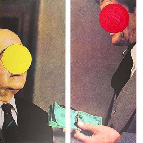
In your paintings, you reduce things even further, so we are left just with surface - but what a surface!
I think Judy's impression of children comes from the reductive quality. These are people stripped down to something almost less than essential. And for all our universal love of children, they are unformed - we don't know precisely who they will be when their "identity" is complete.
Really excited about these. Perhaps you can push the surface more - but go slow. These are terrific.
These are lovely - If people are wiser they should take these from you before you get really famous! You should have done your final project presentation in mixed media too.
ReplyDeleteAli